the BruNSWICK
CENTRE REBRAND
Concrete Plans
Set in the middle of Georgian Bloomsbury, The Brunswick Centre stands as a beacon of Modernist thinking. Bold, beautiful and completely at odds with the surrounding area, it has been the object of fierce debate, a lot of love and a lot of hate in its short life. Good Humans were asked to put together the final piece in its hugely successful revival.
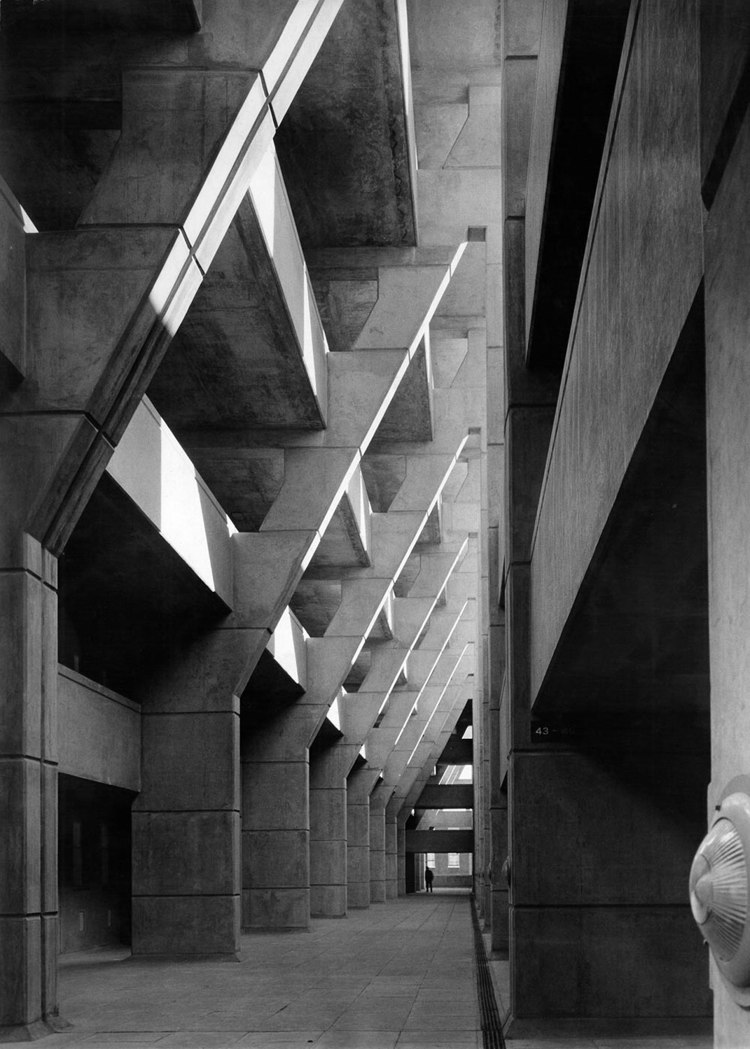
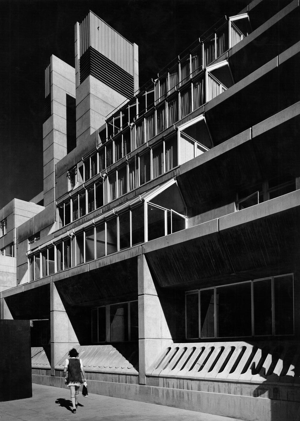
Built in the early 1960s, the Brunswick Centre’s architects planned a utopia where living, shopping and play all converged in the warm embrace of its wide concourse.
Sadly over time it had become tired and unloved. Misaligned priorities, insufficient maintenance, and warring local pressure groups meant that it could not live up to its Modernist dream.
Then, at the turn of the 21st Century, the site was bought by owners with a vision. Their approach was transformative. The building’s facades were meticulously cleaned, bringing back the crisp geometry and boldness of its original design. The wide concourse, once tired and underutilised, was reimagined as a bustling, inviting space filled with carefully curated retail and dining experiences that elevated the Centre’s appeal. With this revamp came a raft of top-end stores, world-class restaurants and inclusive community initiatives.
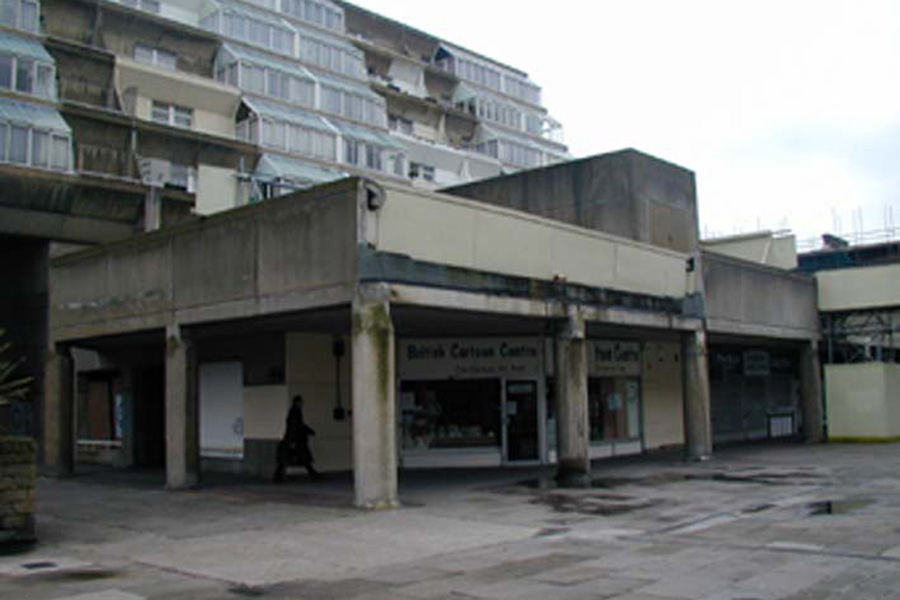
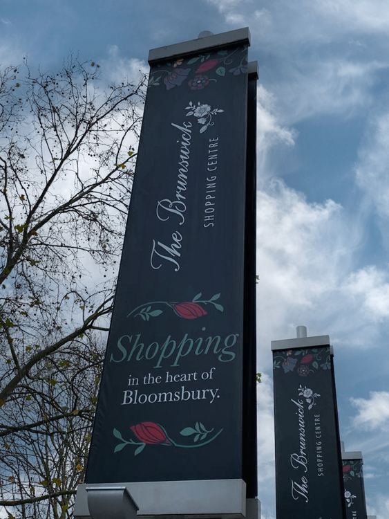
However at all sides of the site was an anomaly. The branding – across flags, signage and wayfinding – felt like it was for a different building. No one knows where it came from. With a cursive valentine font and a rose for no reason, it said nothing about the history, legacy and vision of The Brunswick Centre. It had to go.
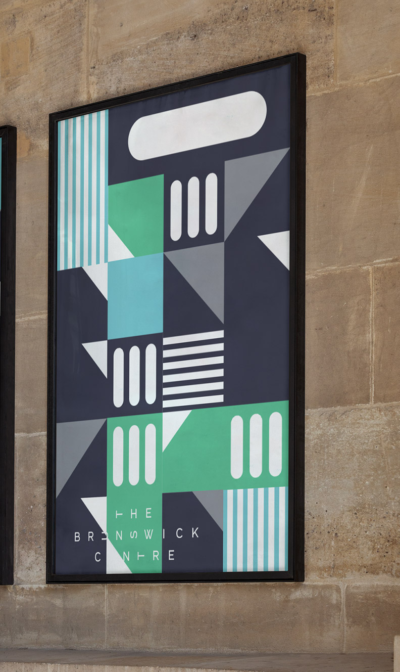
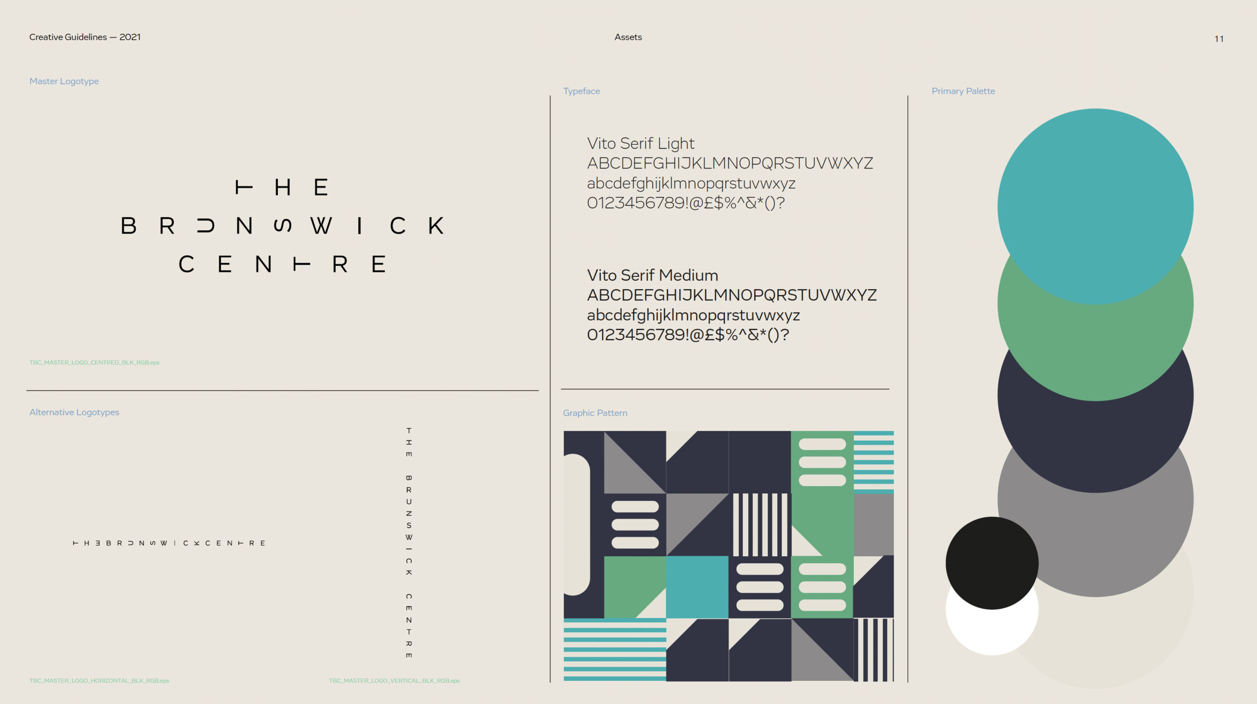
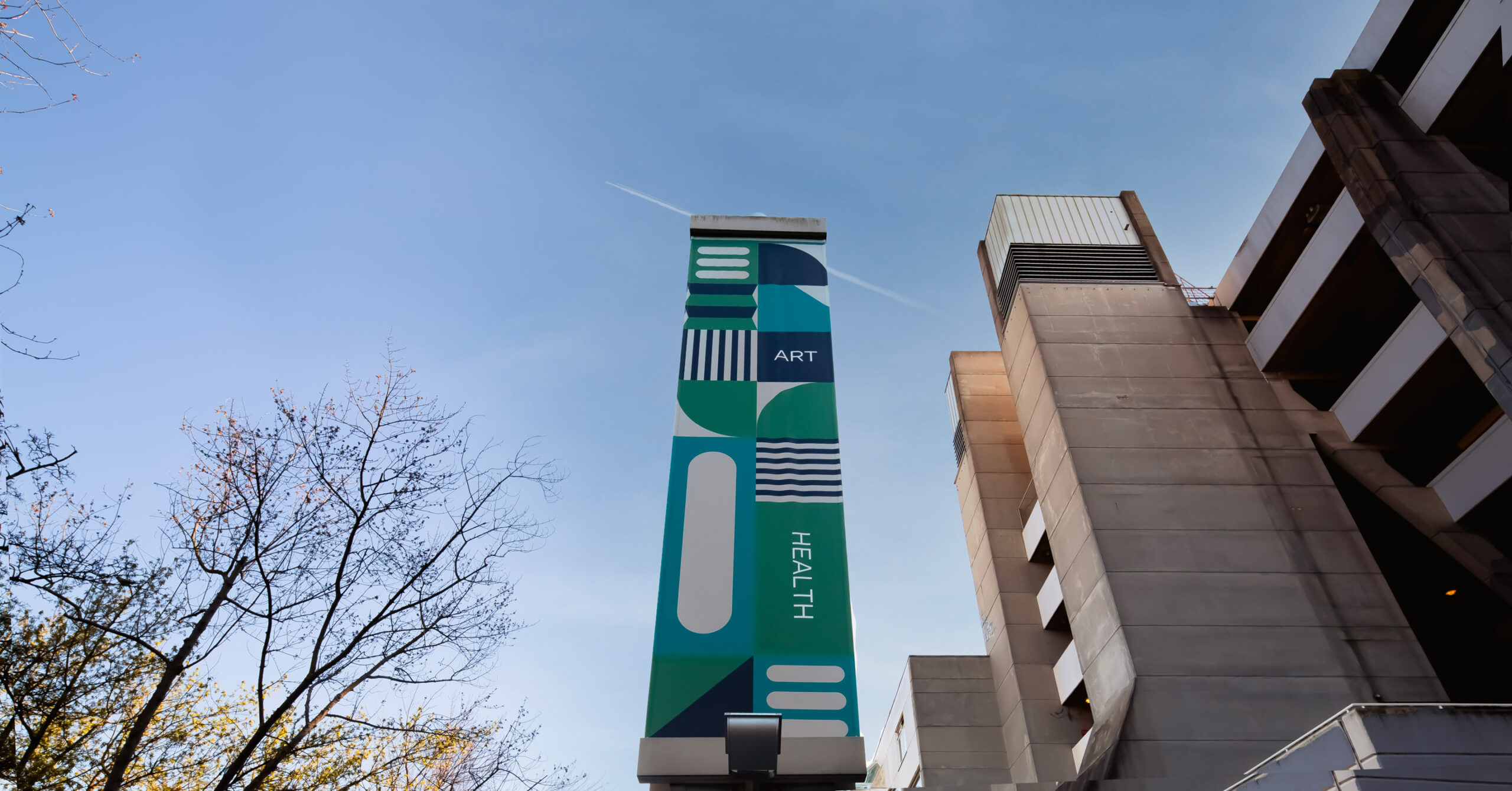
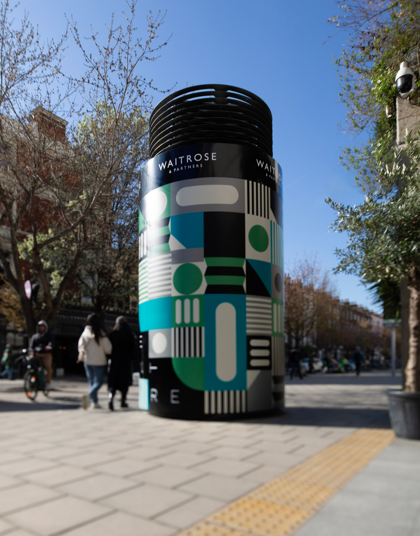
The new designers understood that whatever they created had to exist in the physical built environment and Good Humans played a pivotal role in bridging the theoretical with the practical. We were in a constant conversation of iteration, test, learn, and apply, until together we found an identity that worked. Designed to reflect the endlessly interesting angles of the centre itself, the logo is a forced monospace – each letter is in a square and each square can be turned to ensure the logo stays interesting and alive.
![]()
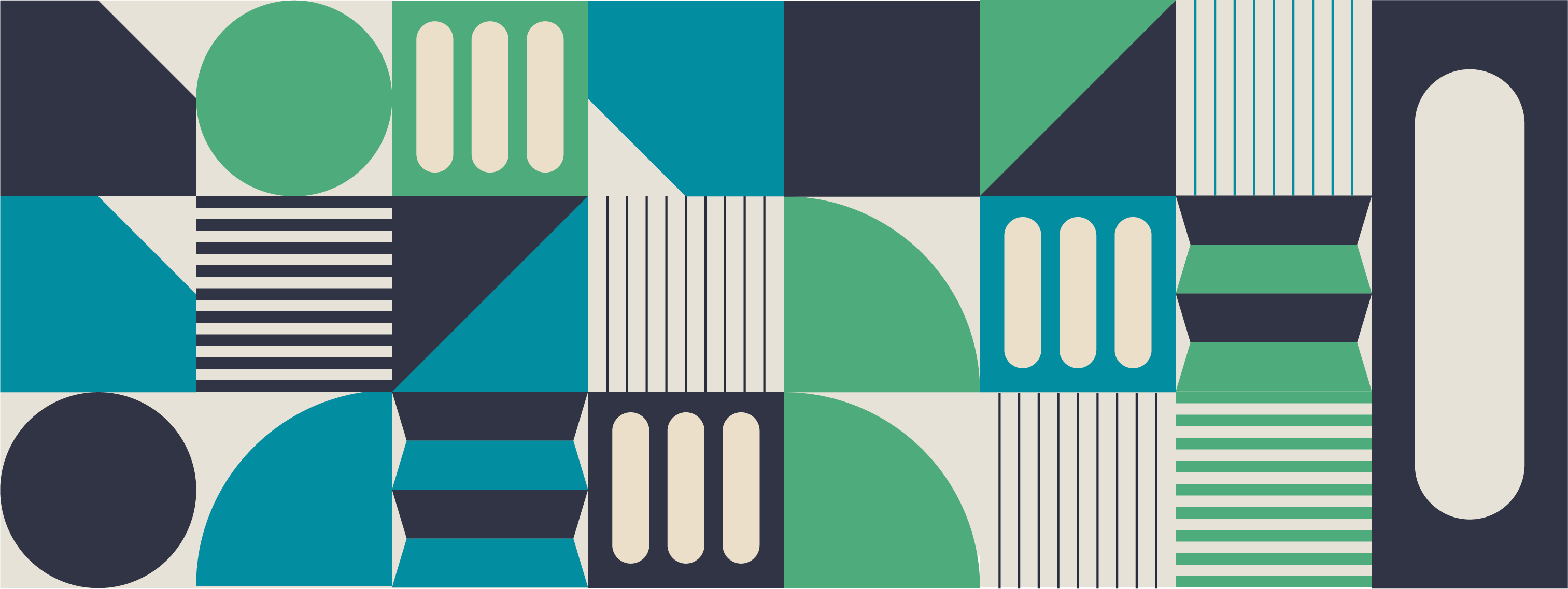
After early asset-building, Good Humans felt that we needed something to hold the elements together. Taking visual cues from the Centre itself, we approached the designers to suggest a pattern, rooted in Modernism, and modular in nature. They nailed it. Focussing on snapshots of beautiful architectural detail around the site, we were able to create a pattern that could go large or small, wide or tall and everything in between.
Once the master brand was established, Good Humans was handed the full project to bring it to life. We established rules, guidelines and assets, focussing on adapting the visual elements of the striking new identity to bring this Brutalist masterpiece into the 21st century.
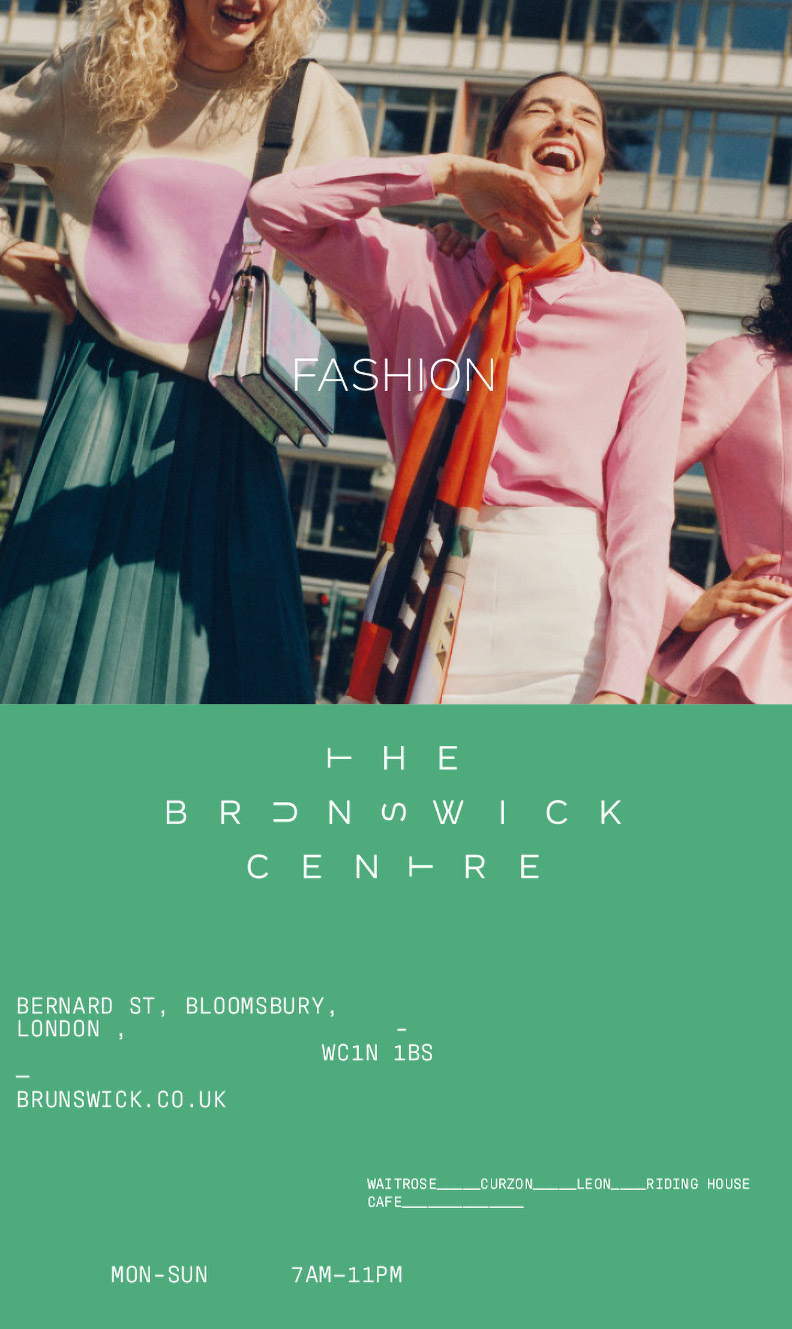
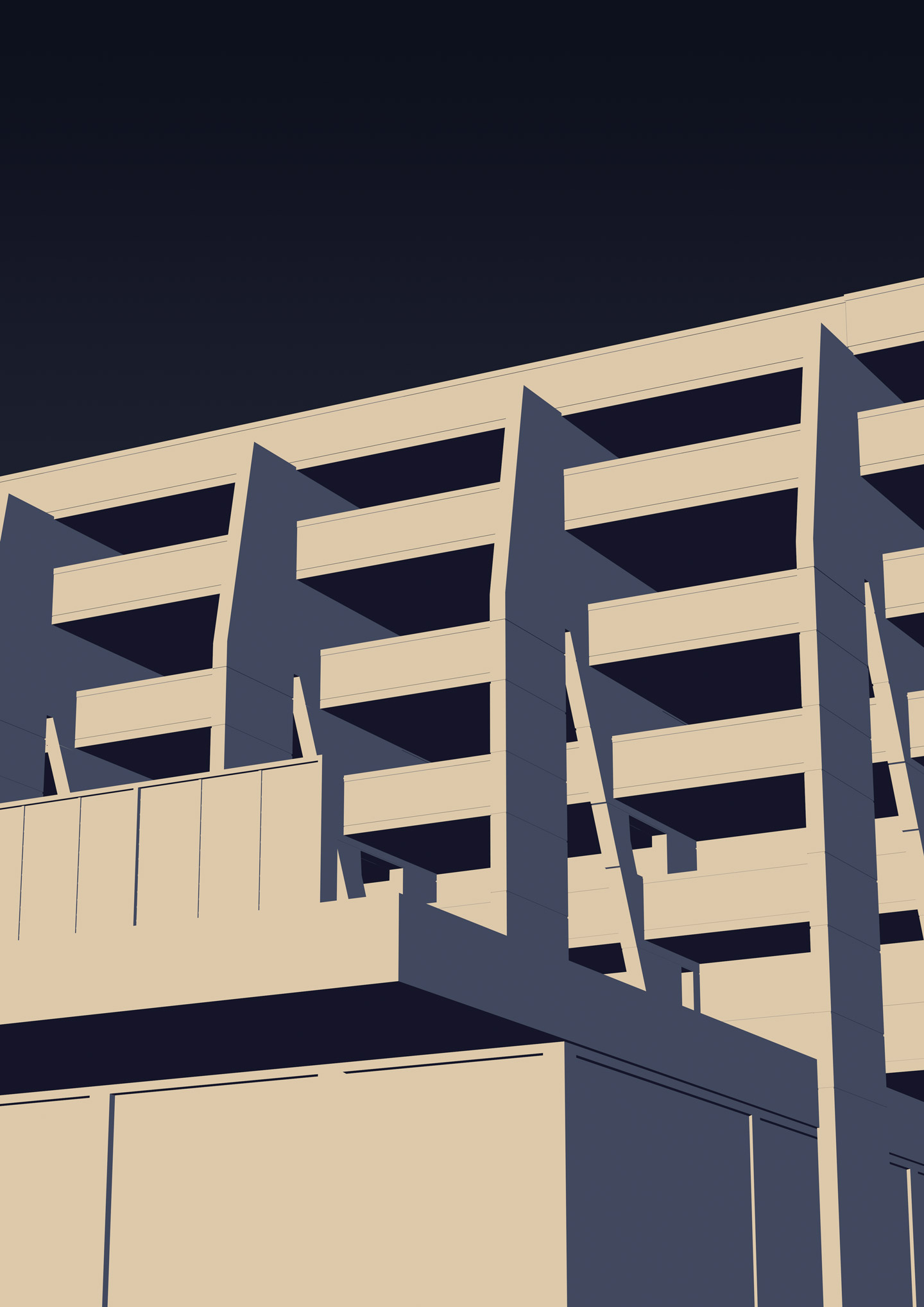
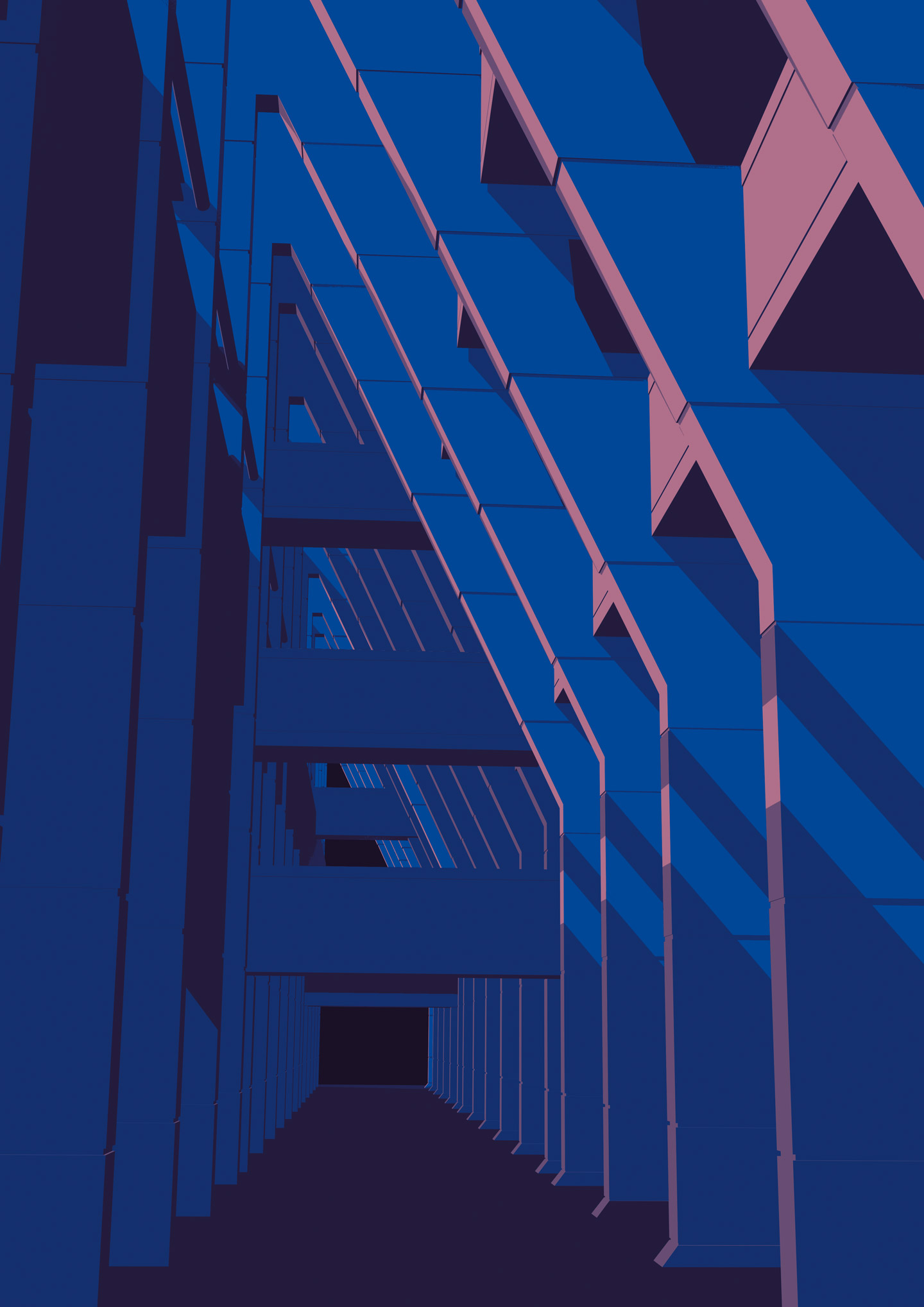
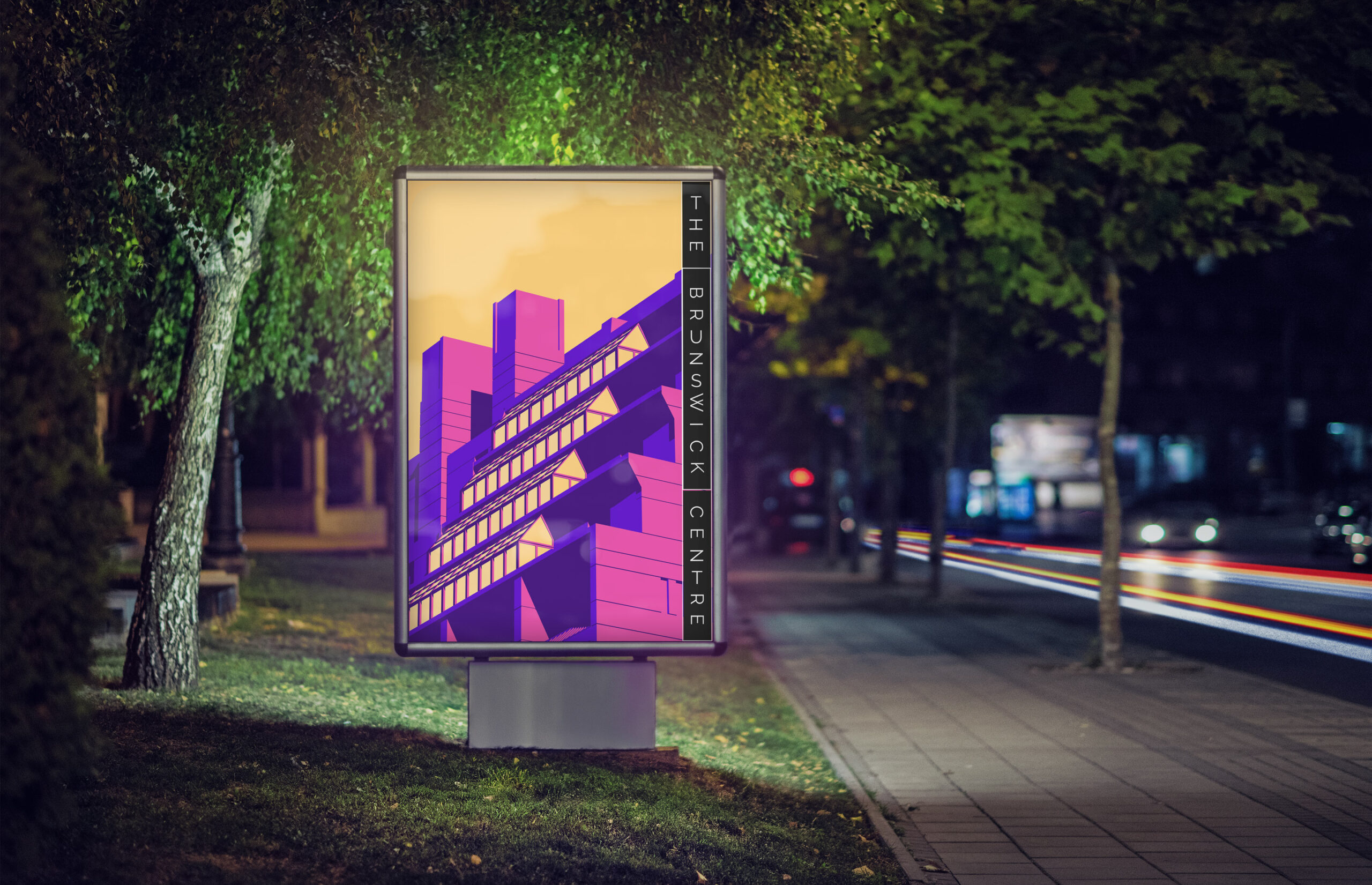
From the start, the building was the hero. For that reason, we wanted to show it in its best light and we had a lot of fun creating Modernist posters that highlighted some of the most beautiful lines of the site. Set in good-light moments of the day, featuring colours from the new guidelines, we pushed the building to the near-abstract and created these images for use in ambient branding. Some of these areas of the Brunswick Centre are not accessible to the public so it was great to be able to show them.
And it was Good Humans who brought the broad mix of stakeholders together with regular pulse meetings to plan out how best to deploy the new identity. From the owners, architects, operations managers and building managers, social media teams and events planners, we were able to bring the specialisms together and unite them under the banner of good design.
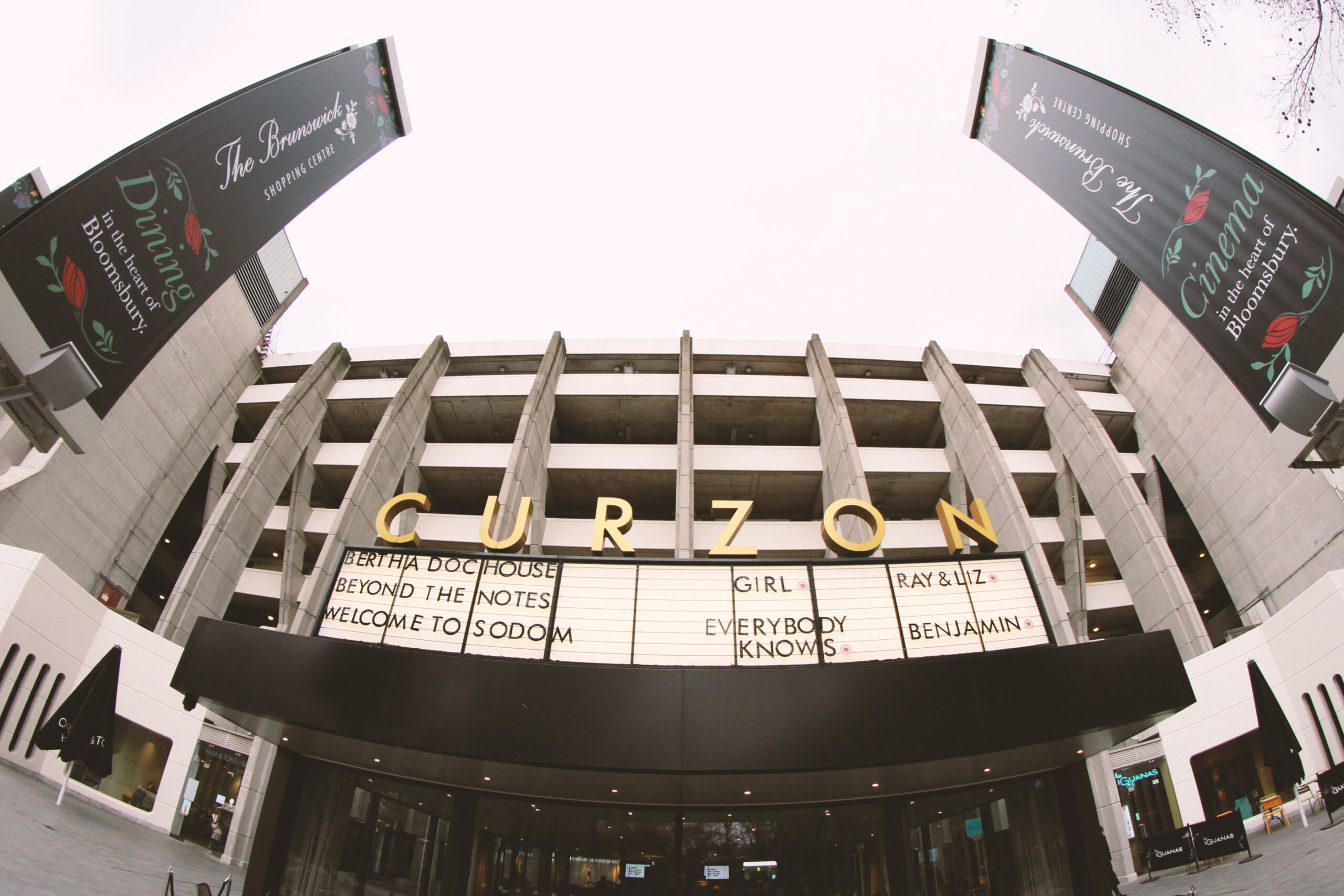
And we got very far until… silence. For a long while and for various administrative reasons, the brand was not replaced anywhere but on posters and socials. The old floral designs stood for months on end. The Centre was, as so many times in its history, living in limbo. Until finally, we got the nod. The signs were up. And we are beyond proud of how they look. Alive, bright, modernist but modern.

Seeing this vision come to life across the Centre’s site is a reminder of the transformative power of good design executed well. The Brunswick Centre’s new identity stands as a testament to its enduring role as a vibrant, multi-use space in the heart of London.
“This is a massive step up from where we were before. It represents us as a business and has helped, not only with the widening of our demographic but with the increase in our footfall. I am very happy we found you Good Humans.”
John, Brunswick Centre Property Manager